
finishing materials market makes it possible not to limit itself in a choice of colors. How not to make a mistake and choose the right one?
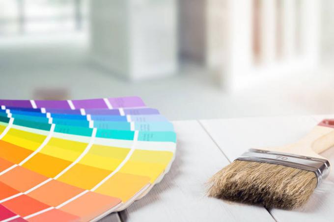
1. Ask a brief catalog of colors
Each manufacturer of interior paint has a full catalog with hundreds, or even thousands of colors - and short, where the main or most popular. Full catalog more suitable for designers, which every detail matters. The average user it just will confuse. To avoid selecting a few hours out of 30 shades of peach, just ask for a short catalog.

2. Do not choose the color on the internet
Hue is highly dependent on the color screen, because a user can see, for example, blue-gray, the other - the gray, and the third - the gray-green. It is best to choose the catalog directly at the point of sale of paint, which you and will mix the color you want. But remember that if you want someone to consult and send a photo example of the selected color, then - Again, because of the different color - on the other side of the screen a person can see a completely different shade.
3. Take into account the opinion of the person who will be more likely to be in the room
Traditionally, the color of the kitchen hostess chooses the color of children's best to discuss with children, even small, and the color of the bedroom should be selected together. The hardest thing to the living room - here are all roughly equal amount of time. Well, immediately throw away the colors that obviously do not like your home. At the same time in the same room, you can use two or even three colors of the walls - as accurately get to reach a compromise.
4. Combine with furniture
If you already bought the furniture - the wall must be combined with it. If the furniture is white or natural wood color - it will fit almost any color of the walls. If the furniture is colored - the walls should neither merge with it, either explicitly clash or create visual noise due to the medley of colors.
5. Avoid overly bright colors
Extremes are always undesirable. If you lived long in total beige and now want to add some color to your home - the right note in the catalog on the luscious shades of green or orange. It is important to remember a few nuances. When applying the paint on the wall it will be even brighter than the picture in the catalog. In this case too bright color tire the eyes, are irritating to the nervous system. Bedroom definitely should not be too bright - this will prevent your sleep.
Remember that the picture in the catalog - not the same thing as the whole wall in that color, and sometimes all four. If you want to add a bright accent - it is better to experiment on one wall, and the other less paint bright paint.
6. Pay attention to the texture of the walls
If you are going to apply paint over the textured plaster, then remember that a wall will look darker shade than in the catalog.
7. Try several colors
If you find it difficult to decide the minimum amount order several shades of paint. You can put them directly on the wall at home and see how it will look. So make a choice you will be much easier.
8. Do not take too close to each other shades
A common design for this wall is a combination of lighter and more saturated from one color hue range. That is, two walls painted a bright shade, and two - dark. In the catalog colors do look very different, but in fact, due to differences in coverage, the availability of the color of the furniture will be virtually identical.
If you want to achieve this contrast, the lighter shade should be as light (many afraid that he will be hardly noticeable - but it is not), and the dark - so dark, so as not to make the room gloomy.
You will be interested to know 5 Interior errors that are found in every apartment.
